CanLoan

UX/ui design
CanLoan app is a student loan service app for National Loans Service Centre (NSLSC) — a Canadian national student loans service centre. The app provides a loan tracker to show the process of loan statement repayment as well as to check upcoming important deadlines.  


Overview

Duration
6 weeks
Feb - March 2020
Type
UX/UI design
Solo school project ( a part of Mobile App Design course)
ux Tools
Persona | Journey map |Empathy map | Card sorting |Wireframes |Prototype
Program Tools
Adobe XD |Adobe Illustrators |Sticky notes, papers & pen

Target Audience

National Loans Service Centre (NSLSC) users, specifically the users who are in the process of repayment, because they will likely monitor their loan activities more than other groups of users.

Objectives

  • To display loan details that is easily & visibly found
  • To reduce the steps of getting to important notice from the service's inbox
  • To declutter the service's information & categorize into groups

Background

This project initially started off with a Design Jam session during a class time to help shake up some ideas for our project.

The initial problem statement from the Design Jam

“Nicole wants to streamline the way in which she receives notices and/or information from government officials because of her frequent moves resulting in address changes.”
This idea was based on my frequent moves as it is difficult to keep up with address changes, especially government services.

Shifting the Problem Statement

  • The initial idea was too big
  • It was advised to scale down and focus one of the government's departments as the information architect would be too simple.

Choosing the specific department

  • National Student Loans Service Centre (NSLSC), a web-based government's student loans service, as one of my friends recommended to check their service out.
National Student Loans Service Centre (NSLSC)'s website

User Research

Secondary Research

I began my research on Stats Canada (Figure 1 & 2) to have a general understanding of my potential target audience.

Figure 1: Percentage of people who use some sort of student loans
Figure 2: Common source of student loans is from the government

Key Takeaways

  • Despite % of graduates who had debt owing government might sound small, this proves that there are quite a number of users who use the government service.
  • This also shows that there is a market for my potential users

User Interviews

Simultaneously, I conducted interviews to help me better understand the experience of using student loan services. Also, I realized that the original problem is no longer appropriate as the service only sends physical mail once.

Their frustrations & insights

  • The existing flow of the service are checking a new message takes quite a few steps to get to the inbox portion (figure 3 & 4)
  • Users feeling drowned in texts as there are loads of information
  • Majority of the interviewees spend their most time looking at the loan statement & check how much they owe the government

Figure 3: A flow of accessing the personal loan statement details in the service's existing flow
Figure 4: A flow of receiving the service's notifications in the existing flow

Key takeaways

  • Users’ frustrations are the steps that they have to go through the service and there are a lot of unnecessary clicks
  • Reorganizing the existing flows with a help of mobile app would be sufficient to make the users feel less frustrated
How might we display the student loans' information in an accessible & convenient way?

Discovery Phase

Empathy Map

The empathy map helped me gather research insights & understand my target audience as I'm not familiar with the student loans service


Persona

I created the persona based upon the user research & empathy map to understand the users better.


Journey Map

The journey map was a helpful tool to walkthrough the whole process of the student loan service as I'm someone who is not familiar with the student loan service.


User Stories & Card Sorting

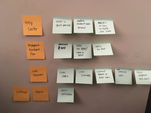
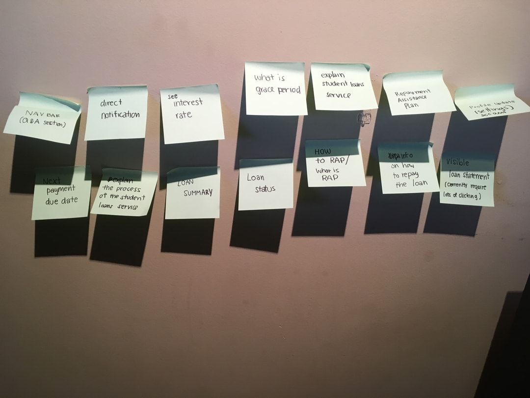
I gathered the user stories from the user research to justify the users’ needs. Moreover, I wrote those needs on the sticky notes & card-sorted them to determine the main features for the mobile app.


Navigation Structure

  • Used a card sorting to determine which type of navigation structure to use for the app
  • Chose a tab bar for the navigation pattern because of the high discoverability
Main Features
  • Loan Statement
  • RAP (Repayment Assistance Plan)
  • Inbox
  • Help Center

User Flows

After creating the navigation pattern, I worked with the user flows to identify how many screens I would have to design.

First User Flow

  • The flow reduces the logging in steps that the users would have to go through
  • Users would be able to receive a direct notification & inbox feature within the app.
Scenario: Nicole receives a push notification on her mobile about an upcoming repayment deadline.

Second User Flow

  • The flow gets rid of dashboard from the existing service flow
  • The loan statement screen acts as a home screen for the app, because I discovered from the interviews that the users spend most of their time on checking the loan statement.
Scenario: Nicole receives a push notification on her mobile about an upcoming repayment deadline

Third User Flow

  • The flow provides a help center section to organize the service's information into groups depending on which stages the users are on.
  • The existing service's FAQ section are listed in a way that users had the drowning-in-text feeling.
Scenario: Nicole forgets what she has to do for repayment period as she is still transitioning from Grace period

Design Process

Low Fidelity Wireframes

Main Screens from Crazy Eights exercise
Low fidelity wireframes on XD

Initial User Test

Feedback from the real users came across on the Loan Statement screen, specifically on the loan tracker.
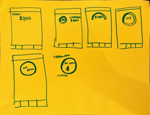
  • According to the users, the tracker is very easy to track the owing loan balance.
  • However, some users were triggered by the word choice which made them feel somewhat depressed.

Solution:
  • showed how much the users have already paid instead of showing % of the loan amount or the word "outstanding fee"
  • displayed the total amount that the users owe in a smaller text size


Integrating Apple's HIG & Material Design

In the middle of the process, I used these guidelines to improve the layout such as safe area and button design

Mid Fidelity Wireframes

High Fidelity Wireframes

Branding

Why Blue?

  • Calm and to reduce anxiety & stress 
  • No feeling of rush
  • Is often used for many government official websites

Why Gradient?

  • A non-boring/ refreshing look on the government platform

Typefaces

  • Helvetica is used in the Canadian government services
  • Open sans is good for longer texts & adds a not-too-serious look to the app
Style Tile

Prototype

Final Solution

A loan tracker to display loan statement
  • Placed on the tracker on the main page as users spend most time on this section
  • Reduced the amount of clicks, compared with the existing flow
A push notification: Users are able to receive direct notices through the mobile app
  • No more multiple steps accessing inbox
An in-app notification: Users are able to receive direct notices through the mobile app
  • No more multiple steps accessing inbox
A help center: Organized the information into groups depending on which stages the users are in the service
  • Reduced the drowning-in-text feeling

User Test

Heuristic Usability

Colour Contrast (Accessibility Test)

  • User test revealed that the gradient with white text may make the accessibility test fail.
  • The test did fail so it is important to be aware of the colour choice & ensure the chosen colour passes the test.
A comparison of a successful and failed colour palette after running through the accessibility test

Navigation Structure Naming System

  • The user’s language, "Repayment Assistance Plan", is too long to be on the tab bar.
  • Simultaneously, the system-oriented terms, "RAP", created confusion among the non-users during the user test(Figure 5).
Figure 5: User's language VS System-oriented terms

Another User Test with the Actual Users

  • Majority of them revealed that they understand the term "RAP". As a result, the "RAP" was kept on the tab bar.
User test with the actual users revealed that they understood the "RAP"

Reflection

What I learned from this project

  • As someone who is not familiar with the student loans service, I think it is very crucial to have an empathy map as it helped me gain deeper understandings of the users.
  • Sometimes functionality does not equate better as it might conflict users’ emotions. I realized the value of user well being.
  • User tests are important in every step, especially working on the unfamiliar system.

If I were to revisit this design again,

I would approach a wider user group, paying more attention to those with disabilities as they might have different needs and limitations while using the service.